Entries by Philip Koether (30)

Tuesday
Jan112011

In Restaurant Design, One Color Is Red-Hot

Across New York, restaurant-goers are seeing red.

Walk into the Darby, a new, upscale restaurant with live music, and you will see garnet red. Everywhere. On the ceiling. Covering the walls. Gracing the plush, mohair booths.

"Red is a sexy color," said Steve Lewis, a partner in Lewis-Dizon, which designed the space. "More importantly, it's a color of power. My perception of the place is that it was going to be a place for those who have already arrived…and red is a very good representation of them. It's the Chinese color of luck. The emperor wears red, right?"

Long popular in the restaurant and food industry, the color red of late is making brash new strokes, gracing high-end supper clubs such as the Darby and the futuristic-looking Bar Basque in the Eventi hotel, and bright splashes in smaller ways, from banquettes in the posh Lambs Club to doors in the anticipated new restaurant the Dutch.

"In the '70s the color was pink, like a blush; in the '80s it was kind of mustard yellow….Now we really get a lot of red," said Clark Wolf, a New York- and California-based restaurant consultant. "It started at the higher end because really wealthy communities love Chinese lacquered walls, and these things trickle into the rest of the culture."

Those in the industry say the popularity of red can be attributed to several factors. It's the most popular color for food packaging and is believed by some color therapists to stimulate appetite.

Red accents and leather banquettes are also a throwback to the more opulent era depicted in the TV show "Mad Men," which is a popular current design aesthetic for a lot of hotspots in New York.

Chinese restaurants commonly feature red menus and décor because their culture considers red a lucky color. And red even crops up in names, such as the Red Cat restaurant—which has red paneling and plates—in Chelsea and the recently opened Red Rooster in Harlem.

"We're aware of some of the psychological features of red," said Kristina O'Neal, a principal at AvroKO, a design firm. "We have always heard that the most successful restaurants or the top-grossing restaurants feature red in the main dining room. We don't know what's urban myth or fact."

Of AvroKO's recent designs, two featured red, but they are smaller rooms within sprawling projects.

At the Hurricane Club, a multi-room tikki restaurant and bar, the Volcano Room boasts lava-red walls; and at Beauty & Essex, the Lower East Side's latest nightlife entry, more than 1,000 wood-carved panels are buffed in a deep red in the Pearl Jubilee room, which also features red-leather banquettes.

"Red is an excite color, so the energy level goes up in a bright-red room." said Ms. O'Neal. "If you have too much of it, the experience can go from warm energy to visual exhaustion fairly quickly."

Others are finding that there is no such thing as too much red.

"What I like about Bar Basque is the red is not an accent, it's enveloping; the whole space is one color," said Philip Koether, principal of Philip Koether Architects, which designed the space with Syd Mead, better known for his designs of transportation projects and movies such as "Blade Runner."

Mr. Mead said he chose red, black and chrome because it was a masculine combination associated with the Basque region. The hallway leading to Bar Basque glows red from backlit, fiberglass-reinforced panels that also cover the lounge and restaurant, from the ceiling to the walls.

"As the lighting gets darker, red doesn't lose its chromatic impact on the eye," said Mr. Mead. "Pastels and other colors change and lose color intensity as it gets darker."

And there is another benefit to boot: "I think it makes people feel good and it makes people look good when they're dining," said Mr. Koether. "It makes the food look good as well."

Write to Sumathi Reddy at sumathi.reddy@wsj.com

RED
Philip Koether Architects

One of the designers of Bar Basque, above, said he likes it because 'the red is not an accent, it's enveloping.

Friday
Jan072011

Luxury living: Manhattan's Beatrice is a new high point in New York rentals  

Friday, January 7th 2011, 4:00 AM

Sunny luxury anyone? A model unit of the interior of the Beatrice.

The luxury rental has come a long way from granite countertops, health clubs, roof decks and retail banks at the base.

That was so six months ago.

With a rental property, hotel, two restaurants, three elevator banks, 500-car public parking garage, 54th-floor resident lounge, two ballrooms and three bars, you could get lost in and around the Beatrice, a mixed-use building at Sixth Ave. and 29th St. This is now, and when it comes to the competitive landscape of luxury rentals, "now" means a total living experience.

As much food and entertainment complex as rental, the Beatrice sits atop the 23-story Eventi Hotel, a public plaza with a stadium-size seven-figure-priced television screen and two red-hot restaurant concepts. The 301 rental units start on the 26th floor, meaning the views from every apartment are some of the best in the city.

In five months, the building is 77% rented with four $20,000 penthouses coming on the market next month. Studios start in the mid-$3,000 range with one-bedrooms hovering around $4,500.

"These apartments start 300 feet in the air, meaning our views begin at a height where most of our competition's stop," says Evan Stein, president of J.D. Carlisle Development Corp., the lower Park Ave.-based, three-decade-old developer of the project. "The idea from the beginning was a condo-quality luxury rental. You have to deliver a one-of-a-kind, quality product to draw people today."

From corner units on higher floors, the entire city lays out in front of you. This building gets residents closer to the top of the Empire State Building than any other. From every apartment, bridges and rivers are part of the view. New York-based Perkins Eastman, architects of the pending Flushing Commons in Queens and 123 Third Ave. on 14th St., designed the building that rises above Sixth Ave. like an exclamation point. The interiors, by midtown west's Philip

Koether Architects, are heavy on high-tech.

Walking through FoodParc and Bar Basque, the two Beatrice restaurants conceived and operated by Jeffrey Chodorow's China Grill Management, the group who created Asia de Cuba, you feel like you're in some futuristic movie set.

Bar Basque, one of the largest Spanish restaurants in the United States, is deep red with a long lounge, dark passageways, curvy interiors and a by-the-glasse wine dispenser. The dining room sits under a solarium with retractable roof. It looks directly at the stadium-size screen that plays old movies and sporting events. With the screen on, a movie buff may feel like he or she is in "Blade Runner," the 1982 cult film starringHarrison Ford as a bounty hunter looking for rogue clones. Koether designed the restaurant with Syd Mead, the legendary Hollywood set designer famous for "Tron," "Blade Runner" and other sci-fi hits.

The same tech-savvy design carries over to FoodParc, a stark white free-WiFi kiosk-styled food court with an elevated dining area that's more amphitheater than restaurant. To move people through the ordering process, customers select items using digital touchscreens located throughout the establishment. One food kiosk, RedFarm Stand, offers Chinese fare from Joe Ng, the chef at Chinatown Brasserie in NoHo and formerly at World Tong Seafood in Brooklyn. 3B's (bacon, burgers, and beer) has farm-fresh Wisconsin bacon and a top-rated city burger. A menu of microbrews rounds out the menu.

‘We didn't want anything to be normal in the entire complex," says Stein, who started as a super and construction manager in the company founded by his grandfather. "There is nothing average here — not the views from the apartments, or the food and design."

Bar Basque has already become a draw among Spanish tourists and foodies, who make the restaurant a destination for its food, size, and design.

"This is the first really big Basque restaurant to open in New York City, and it's become a source of pride for many Spanish people," says Terry Zarikian, creative director of Bar Basque who rents an apartment in the Beatrice. "While we are proud of the design, the emphasis is on cuisine. The Basques are one of the most innovative cultures in the world for food, and we want this to be a center for tasting and enjoying their creations."

A stairwell from Food Parc to Bar Basque allows diners to go to and from both restaurants. Different areas of the building are connected physically and virtually, by passageways, stairwells and sightlines. The restaurants operate as the hotel's room service and banquet kitchens, allowing the developer to maximize space. J.D. Carlisle's construction arm handles all of the construction for their buildings.

"That's how we were able to afford to get this built with the different components," says Stein, whose company also marketed and built Morton Square in the West Village. "Doing our own construction allows us to keep costs down, make fast decisions and control budgets and deadlines. If we had to rely on someone else, we'd still be building."

Stein, 38, who named the building after the "most elegant woman" he'd ever met, his grandmother, learned the business from Jules Demchick, 71, who learned the business from Stein's grandfather, the company's founder. For J.D. Carlisle, this generation-based mentoring mixes youth and maturity to bring innovative, well-timed real estate products to the New York market every three to four years.

"Jules always taught me that in times of trouble there will always be a flight to quality," says Stein, explaining why the Beatrice rented so quickly in an economic downturn. "It's the simple things that drive luxury rentals, like embedding the shower rod in the ceiling or having a 24-hour concierge on call for every resident, whether they want a restaurant reservation or helicopter to the airport."

Renters in the building include a heavy percentage of corporate executives and international professionals looking for location and high-end services. Several major subway stops are within blocks. Penn Station and Madison SquareGarden are 10 minutes on foot. The building also has a yoga studio and full-service fitness center. Its lightning-quick lease-up might be due to a combination of characteristics.

"Even people renting the bottom floors have views that clear the entire area," says Clifford Finn, head of Citi Habitats Marketing Group, leasing this building and most of the other top rental products in the city. "Everyone who rents here has the feeling that they are on top of the world. I think people also love being on top of the hotel."

Demchick, considered a real estate marketing guru for delivering high-quality product after high-quality product, recognizes views as a main draw but says the unique size and location of the building site gave the project definition.

"I'm a student of zoning," says Demchick, Carlisle's chairman. "When I realized this site had no real height restrictions, a full-frontal block for retail, and we could build a 500-car garage, the idea took shape. It allowed for a real hotel, not boutique or trendy, and it gave us the chance to build apartments on top, something I've always wanted to try. For the restaurants, we needed an operator who could create a buzz and deliver food and entertainment to the hotel crowd, renters and locals. That's not easy, but we were able to do it." 

Go to beatricenyc.com for more information.

Rendering of the exterior of the Beatrice.

Read more: http://www.nydailynews.com/real_estate/2011/01/07/2011-01-07_luxury_living_manhattans_beatrice_is_a_new_high_point_in_new_york_rentals.html#ixzz1AO0hpNTI


Tuesday
Nov302010

TOM PATTI's MIAMI RAIN Sculpture Reflects the Spirit of Miami


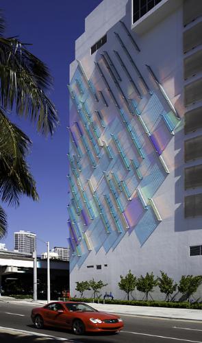
MIAMINov. 30, 2010 /PRNewswire/ -- Motorists eastbound on I-395 going to Miami Art Basel in Miami Beach this week or the Wynwood Arts District need to check out artist TOM PATTI's MIAMI RAIN, the iconic public artwork on the north and west walls of the Marquis parking garage at 1100 Biscayne Boulevard.

Completed this year, the monumental sculpture is a constantly changing diagonal field of colorful, laminated optical glass and metal that reflects the spirit of Miami and distinguishes itself as a gateway to the Arts District.

To moving vehicles on the adjacent elevated highway, passengers on the Metromover and those on the street below on their way towards the Adrienne Arsht Center, the facade emanates a daylight pattern of spectral color that moves across the surface as the afternoon sun transverses the building. Light animates the sculptural work and the elements of color, texture, reflection and refraction continuously shift with the changing light to create a wave of light and energy that reflects on the wall or back to the viewer. Nighttime the illuminated artwork exudes the sensual and vibrant power of Miami.

This fall, TOM PATTI also joined forces with Syd Mead (the conceptual designer and futurist) to create major art installations at Jeffrey Chodorow's new FOODPARC and BAR BASQUE by architect Philip Koether at the EVENTI hotel on 6th Avenue and 30th inNew York. The major concept for the glass wall art pieces relates to the use of colors and lighting as it affects the natural environment and the mood of the inhabitants.

At the EVENTI site, Patti created STACCATO ART LENS WALL, a glass wall running the entire length of the hotel's outdoor public plaza. The colored art lenses are light and site line specific. During daylight hours, they reflect natural light and change colors, depending on the view angle. During the evening, the lenses transmit color and white light to illuminate the plaza and create an ambiance for street and plaza pedestrians. The art piece for the outdoor plaza is collaboration with Lee Weintraub Landscape Architecture and Lightfield.

read article at:

http://www.prnewswire.com/news-releases/tom-pattis-miami-rain-sculpture-reflects-the-spirit-of-miami-111061289.html


Tuesday
Nov302010

Sentury II released

Sentury II,” The long awaited next book from legendary Syd Mead has finally arrived after nine years. Loyal fans and art enthusiasts will rejoice in being able to view what Syd Mead has been imagining for nearly the past decade. Having illustrated the future for us for the past 40 years, Syd Mead continues to amaze and surprise us with his stunning pieces no matter how much of the future we have seen from the start of his career to present day. Looking through his unrivaled artwork, we still find ourselves continuously waiting for his future to be in our present.

senturyii-hardcover

 To purchase:

http://www.sydmead.com/features/senturyii/

Thursday
Nov182010

New York Times review of FoodParc

OF all the big ideas packed into FoodParc, a food court that slices through the ground floor of the new Eventi Hotel on Sixth Avenue (between 29th and 30th Streets), the most riveting is the design. The elliptical columns and white banquettes are from the mind of Syd Mead, the designer behind “Blade Runner” and “Tron.”
Mr. Mead, 77, calls himself a futurist. Sure enough, FoodParc seems as if it’s from the future, though it’s less a far-off dystopia than a spotless mall opening in Seoul next year. Once Mr. Mead made moviegoers reflect on the dark promise of technology; now he has given New York a slick place to get a burger.
Full article: